
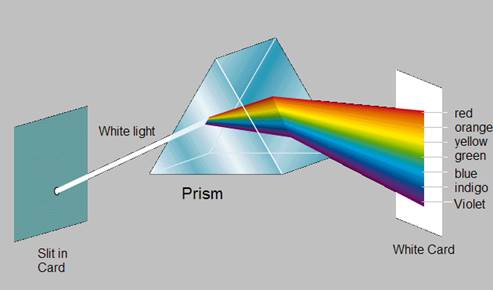
Newton’s experiment:
When light is passed through a glass prism and projected onto a white screen, it is broken up into the spectrum of colours similar to the rainbow - red, orange, yellow, green, blue, indigo and violet.
White sunlight passing through rain drops producing the rainbow is natures way of showing exactly the same thing.
The colour spectrum:
The colour circle:
The colour circle is based on the colour spectrum and many different types have evolved over the years but they all display the logically arranged sequence of hues. Sir Isaac Newton developed the first circular diagram of colors in 1666.
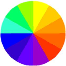
Primary colours (red, yellow and blue) are the basis of all colours when mixing pigmented primaries. They cannot be made by mixing any other colours.


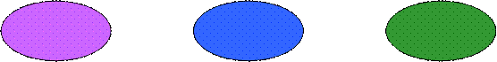
Secondary colours (orange, violet and green) are made by mixing equal amounts of two primary colours


red + yellow red + blue blue + yellow
(Orange) (Violet) (Green)
Tertiary colours (olive, slate and russet) are defined as a colour made by either:
(i) mixing equal amounts of two secondary colours (three colours) or
(ii) mixing a primary and a secondary colour (six colours)


green + orange green + purple purple + orange
(olive) (slate) (russet)
Key learning points
“A pleasant arrangement of three or more colours in a scheme.” The most commonly used combinations are:
MONOCHROMATIC HARMONY:
A scheme based on tints and shades of a single hue or colour.
ANALOGOUS HARMONY:
A scheme where colours close to one another on the colour circle are used colours used from a quarter of the colour circle, e.g. yellow, orange. or yellow to green.
COMPLEMENTARY HARMONY:
A scheme where colours opposite each other on the colour circle are used.
The function of a building is the first consideration when choosing a colour scheme. Schools, workshops, factories, churches, cinemas, houses etc, all present different problems. A colour scheme that works well in one may not work at all in another.
Consideration must first be given to existing furniture and permanent fittings. Some colours because of their association with nature suggest warmth or coolness. Red, orange and yellow the warm colours which create a cosy friendly atmosphere. to a room They give a sense of warmth in rooms that face north and see no sun. Pinks peaches some beiges and rust colours would be part of this family.
Green and blue are the cool colours. They can provide a calm, cool restful atmosphere to a room. Cool colours should not be used in a room, which lacks sunlight (a room facing north). Cool colours can be used in a room facing south or southwest.
The effect of purple depends on the intensity of the colour. should not be used. Another feature of colours is that light colours, tints and pastel colours seem to recede while strong hues seem to advance. Tints and light pastel colours because of their reflective qualities cam make a room appear larger than it is. The opposite effect can be achieved with strong hues and dark shades. When choosing a colour scheme remember to view have imagine it in natural and artificial light. As colour is light the scheme will be altered by a change in the type of light.
Colour schemes in rooms opening onto each other should not clash. Connecting areas such as corridors, staircases should be designed so as to link areas together.
Key learning points
Mixing secondary colours using acrylic tube colours.
The colours that best represent primaries must be used. For example a blue that contains red e.g. Ultramarine, or a blue that has a greenish hue e.g. Prussian blue cannot be used as they will distort the final colour. This follows for red and yellow. This is why it is very difficult to match pigmented colours to the spectrum colours.
It is important to remember the following points when mixing colours.:
Mixing tertiary colours using acrylic tube colours.
When equal parts of two secondary colours are mixed together they produce a tertiary colour.
Draw a series of squares on water colour paper and using a palette of primary and secondary colours intermix them e,g. a primary blue with a secondary orange and so on until all the squares are filled. This gives a very good insight into colour observation
Key learning points
Tint Any colour with white added
Shade Any colour with black added
Tints:


Shades:
Hue: Is another name for colour. Generally refers to colours at full intensity.
Tone: Refers to the degree of brightness or darkness in a colour.
Purity: Refers to the strength of colour. The colours of the rainbow are of maximum purity. Often referred to as saturation or intensity.


Colours without hue; greys ranging from black to white
Pastels:
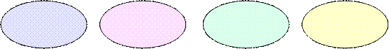

Are colours with black and white (Light grey) added. Usually refers to light colours with a predominance of white added.
Warm colours:


Colours from the red yellow/orange section of the colour circle. They make a surface appear nearer to the observer than it really is.
Cool colours:

Colours from the blue/green section of the colour circle. They make a surface appear more distant to the observer than it really is.
Colour psychology
Well documented experiments have proven that the colours that surround us play in our well being and colour psychology has been used by architects and designers to determine suitable colour schemes for buildings, advertisements, packaging and a whole range of products. For instance, bright reds have been a popular choice for sports cars and lively vibrant colours are natural choices for fast food outlets. These colours excite. Calmer colours such as blue would be a natural choice for when a colour is needed to produce a feeling of relaxation. Each colour is associated with certain reactions, sensations or moods e.g.
White:
White contains all the colours in the spectrum; therefore it can be used with all other colours successfully. It is associated with cleanliness, purity, peace, neutrality and innocence. It is the essence of colour, the source of all others.
Yellow:
Happy, bright, creative, cheerful, optimistic and warm, yellow is the colour of the sun and is associated with life and warmth. Yellow in its strongest hues can be overpowering and dominant other colours and needs to be used carefully.
Orange:
Hot, passionate, exciting, similar rules apply to orange as to yellow. Again, it needs to be used with discretion and gives rich contrasts with deep, cool blues and greens
Red:
This is the colour that has the most intense effect on the eye. It is the dominant colour in most cases. The colour of danger, red brings to mind heat, passion and anger. Red creates tension and quickens the pulse. Used in any appreciable quantities, red is challenging, stimulating and aggressive.
Purple:
The colour of kings. Promotes a wealthy, refined look. Not used as much as other colours. A rich, dark purple can be an effective background colour.
Blue:
The most popular of all the colours. Gives an air of authority, respectability, logic and reliability. Has calming effect. A very good background colour. Works well in most situations and mid to medium deep blues are a good choice for text. Often associated with a feeling of coldness.
Green
Nature’s colour. Restful. Has a calming effect. Green is in the middle of the colour spectrum and therefore is particularly balancing. Overused it can be boring and tiring.
Brown:
A dull sad colour. The colour of the earth. Rich effects can be achieved when used with other earth colours such as russets and deep orange.
Grey:
A neutral colour. Made by mixing black and white, it is particularly useful in that it can be used with any other colour.
Black:
Very powerful, it can be an elegant, dignified, authorities colour when correctly used. Incorrectly used, it can be overpowering and too dominant. Like white, black is devoid of any colour itself, and like white and grey, it can be used with any colours or combination of colours. It can also be used in a scheme to quieten the overall effect.
The NCS System:
In order to accurately communicate the colours we see, we need a reference or notation system with the ability to pinpoint precise colour.
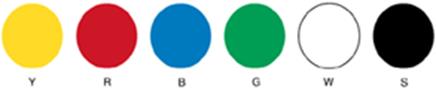
Six Elementary Colours are the basis for the Natural Colour System. These are White, Black, Yellow, Red, Blue and Green.
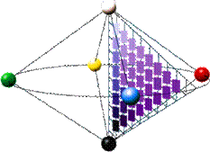
The colours are shown below on the three dimensional model called the NCS Colour Solid. Every colour in the Natural Colour System is contained within the NCS Colour Solid, and can be described in terms of the six Elementary Colours.
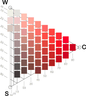
NCS Colour Solid:
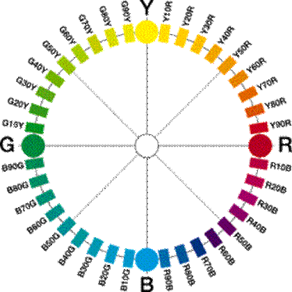
NCS Colour Circle:
In order to more easily pinpoint colours within the NCS Colour Solid, the NCS Colour Circle and NCS Colour Triangle are used.
The NCS Colour Circle is a horizontal slice through the NCS Colour Solid, and shows a progression from Yellow to Red to Blue to Green and back round to Yellow in 10% steps.
NCS Colour Triangle:
All the colours in the NCS System have a percentage of Whiteness or Blackness, and this is best illustrated using the NCS Colour Triangle. The NCS Colour Triangle is a vertical slice through the NCS Colour Solid. C stands for maximum colour intensity or Chromaticness, W stands for White and S for Black. The scales for Chromaticness, Whiteness and Blackness are each divided into one hundred parts which can be interpreted as percentages.
The NCS Colour Triangle and the NCS Colour Circle are used to pinpoint colours within the NCS System. The diagram below pinpoints a colour with 20% Blackness and 30% Chromaticness, with a location on the NCS Colour Circle of Y90R. The complete NCS Colour Notation is S 2030-Y90R.
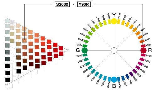
Using the NCS Colour Notation it is easy to define the appearance of a colour. In the notation below 2030 indicates the Nuance of the colour. The Nuance describes the relationship of the colour to Black (S) and to maximum colour intensity or Chromaticness (C). The Whiteness is determined as 50%, as the sum of the values of the three attributes (Chromaticness, Whiteness and Blackness) must always be 100%. The Hue, Y90R, describes the relationship of the colour to the Chromatic Elementary Colours, in this case Y and R. Y90R means Yellow with 90% Redness. The letter S preceding the NCS notation means that the colour is from NCS Edition 2.

Nuance Hue
Achromatic colours (Black, White and Grey) lack Hue and are only given Nuance notations, followed by -N for neutral. S 0500-N is White and is followed by S 1000-N, S 1500-N, S 2000-N and so on to S 9000-N, which is Black.
When working with paint, thinners and cloths it must always be conscious of accidental fire due to spontaneous combustion. Cloths used in thinners must be soaked in water before placing in bins. No matter how small the job is tidiness must be a priority at all times. Storing of materials at the end of the day must be carried out efficiently according to safety and health regulations, e.g. thinners and oil paints to be stored in metal fireproof cabinets.
Colour is an extremely important part of the painters work. It is a very wide field and study of it should be the goal of every apprentice. When dealing with customers the ability to offer good advice on colour adds to the status of the craftsperson. While it is not an easy subject to understand a great knowledge of colour can be developed by studying the NCS system where lessons from basic to advance can be procured.
As we mature the subtleties of our colour perception develop with practice application and learning. Knowledge of colour can open up to the craftsperson a new confidence and ability to encourage others to enhance their homes, work places and environment
Q.1 What are primary colours
Q.2 How are secondary colours made
Q.3 Explain the following.
Q.4 Explain the following colour harmonies
Q.5 What is a pastel colour?
Q.6 What is an achromatic colour
The Art of Colour Author: Johannes Itten
ISBN 0-471-28928-0
Colour Harmony Author: Hideaki Chijiiwa
ISBN0935603-06-9
Choosing A Colour Scheme
ISBN0-7063-7654-4
www.ncscolour.co.uk
www.colouracademy .co.uk
Source: http://local.ecollege.ie/Content/APPRENTICE/liu/Paint_Decorating/M3U1.doc
Web site to visit: http://local.ecollege.ie
Author of the text: indicated on the source document of the above text
If you are the author of the text above and you not agree to share your knowledge for teaching, research, scholarship (for fair use as indicated in the United States copyrigh low) please send us an e-mail and we will remove your text quickly. Fair use is a limitation and exception to the exclusive right granted by copyright law to the author of a creative work. In United States copyright law, fair use is a doctrine that permits limited use of copyrighted material without acquiring permission from the rights holders. Examples of fair use include commentary, search engines, criticism, news reporting, research, teaching, library archiving and scholarship. It provides for the legal, unlicensed citation or incorporation of copyrighted material in another author's work under a four-factor balancing test. (source: http://en.wikipedia.org/wiki/Fair_use)
The information of medicine and health contained in the site are of a general nature and purpose which is purely informative and for this reason may not replace in any case, the council of a doctor or a qualified entity legally to the profession.
The texts are the property of their respective authors and we thank them for giving us the opportunity to share for free to students, teachers and users of the Web their texts will used only for illustrative educational and scientific purposes only.
All the information in our site are given for nonprofit educational purposes